Very Green Expo
Duo exhibition
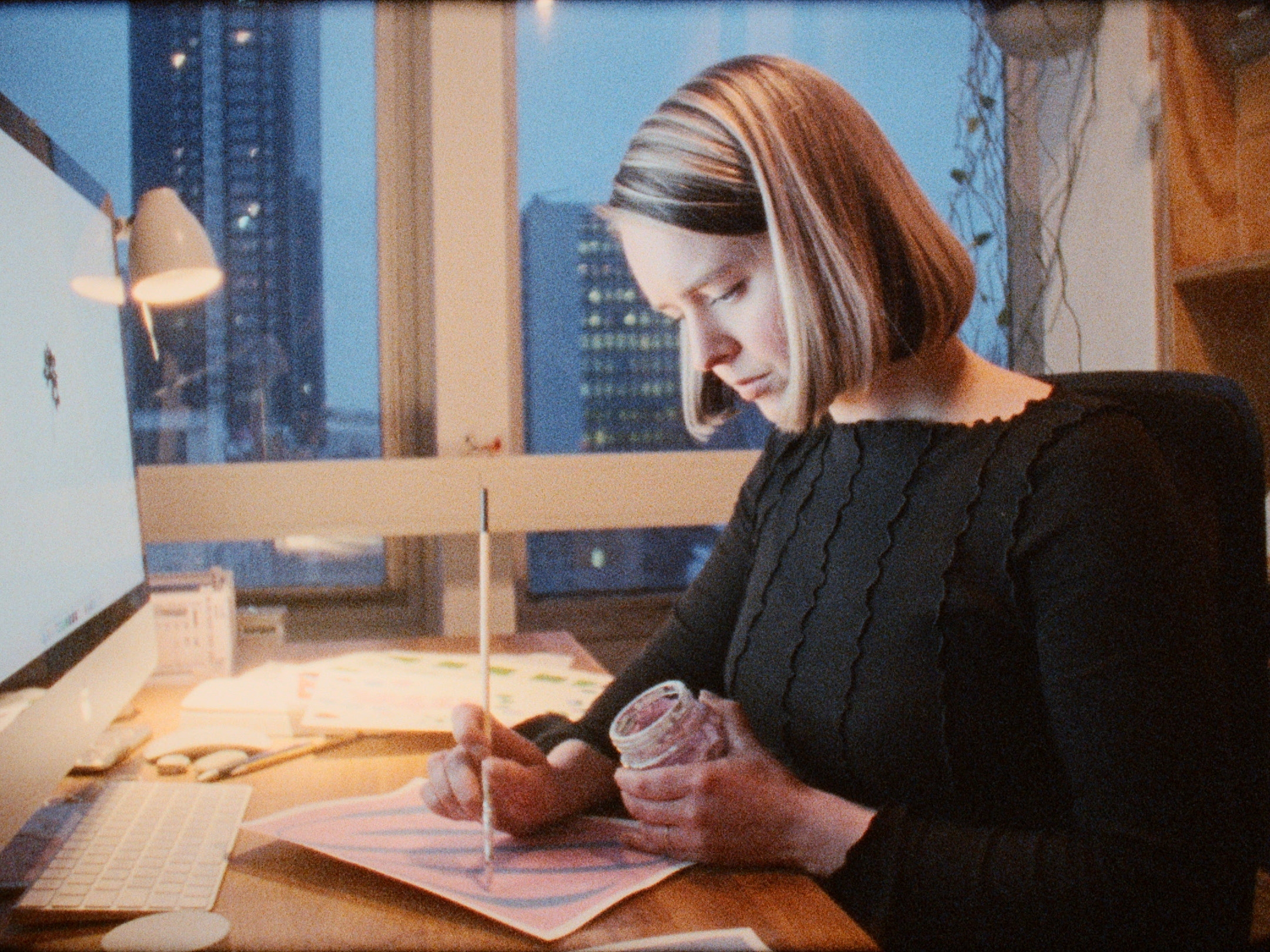
Relaxation so good that the ‘krak’ under your feet suddenly sounds melodious. The overwhelming silence? Strangely calming. And that night’s sleep that feels eternal? Absolute peace. This very green expo offers you the serenity of the forest, capturing its activities and onomatopoeia in a way only nature can—no tent or bug spray required.
This duo exhibition is together with illustrator Maxim de Gilder, on display at Man Met Bril Koffie (Rotterdam) for the full months of January and February.
Are you interested in one of the works? Scroll down for more info!


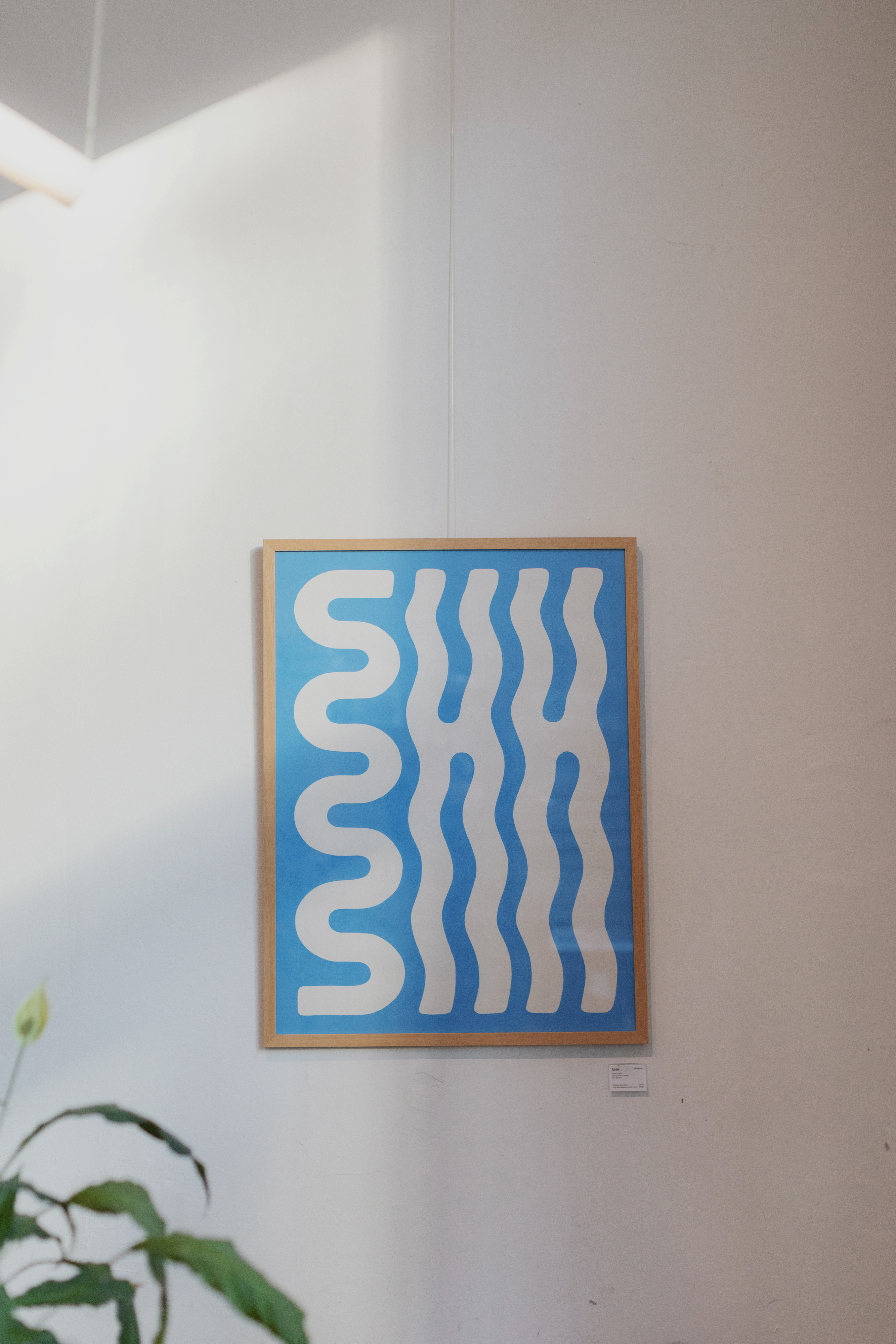


Art prints
80 x 60 cm
High-quality Giclée print
310gr Hahnemühle paper
Limited to 25 pieces
Signed and numbered
Artprint: €120 | with frame: €180 | Original painting: €650
Note that these art prints are a pre-order: these prints will be produced after our exhibition, end of February. You will be notified when the prints are ready.
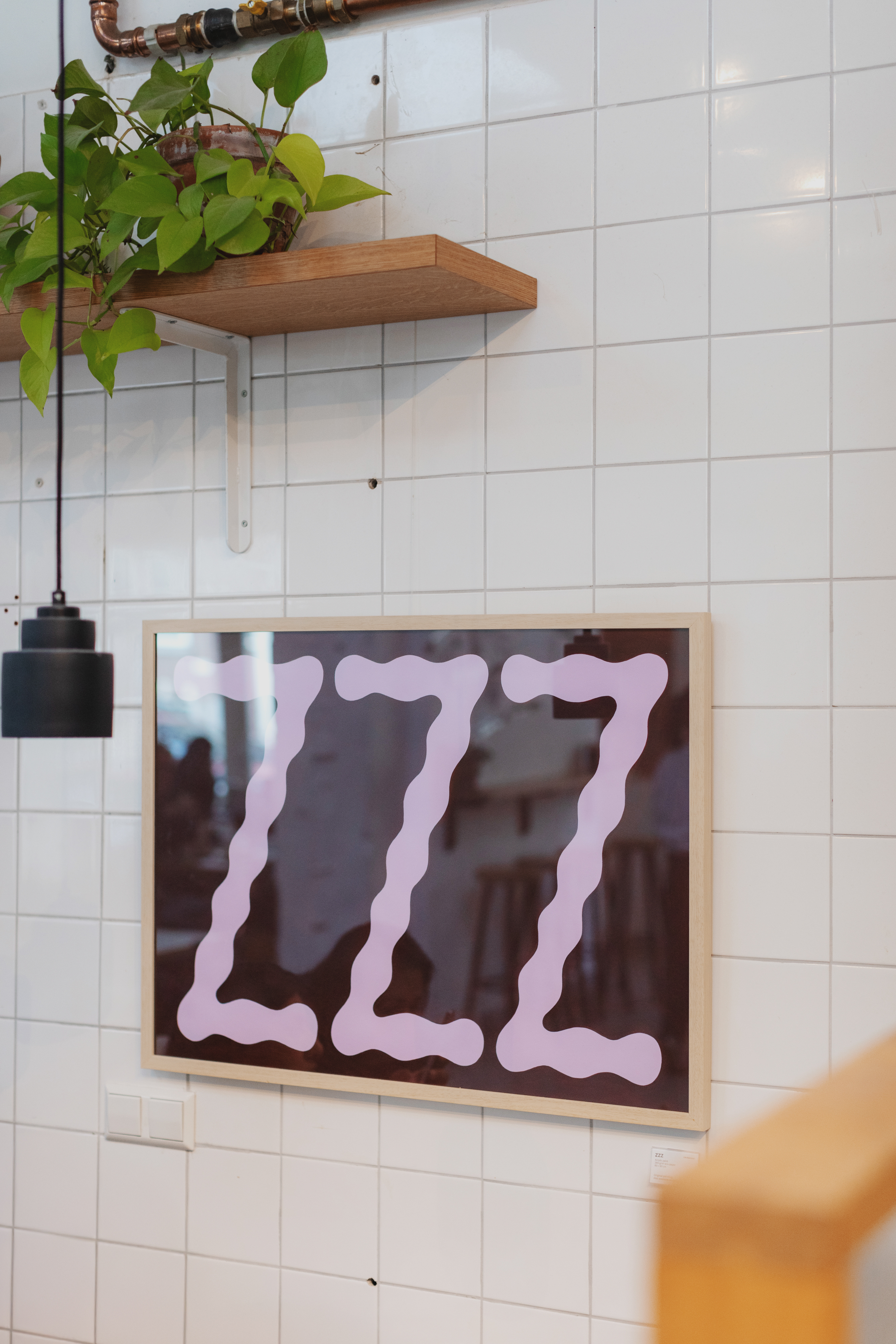
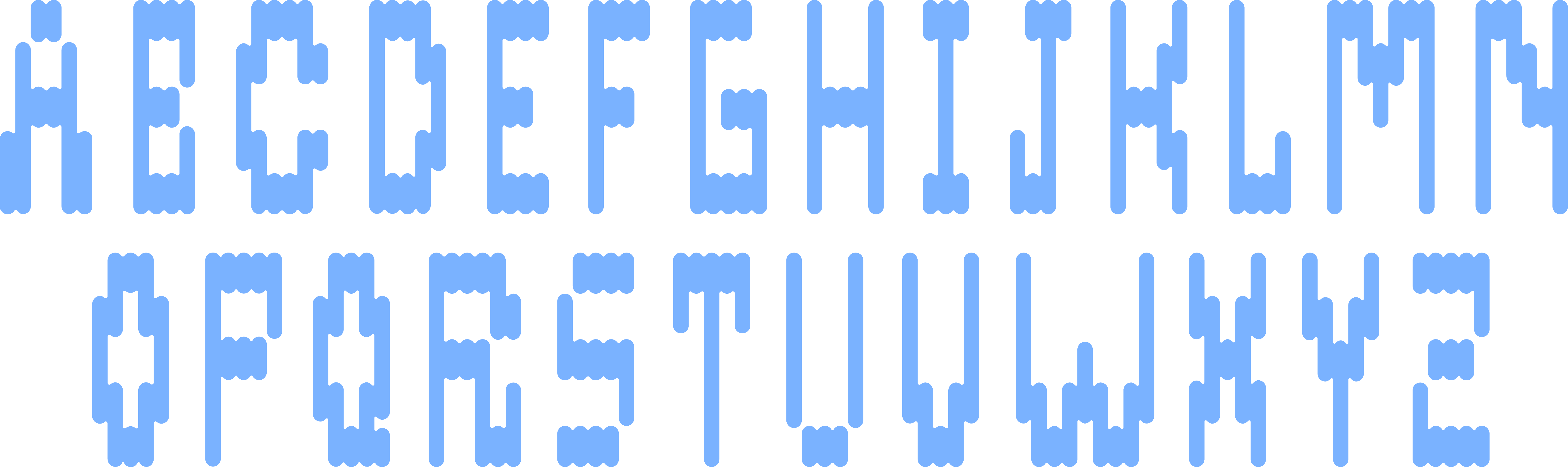
A3 print (collab with Maxim de Gilder)
297 x 420 mm (A3)
Four colour Risograph print
300 gram white paper
Signed and numbered
Limited to 25 pieces
Riso print: €35 | with frame: €60
297 x 420 mm (A3)
Four colour Risograph print
300 gram white paper
Signed and numbered
Limited to 25 pieces
Riso print: €35 | with frame: €60
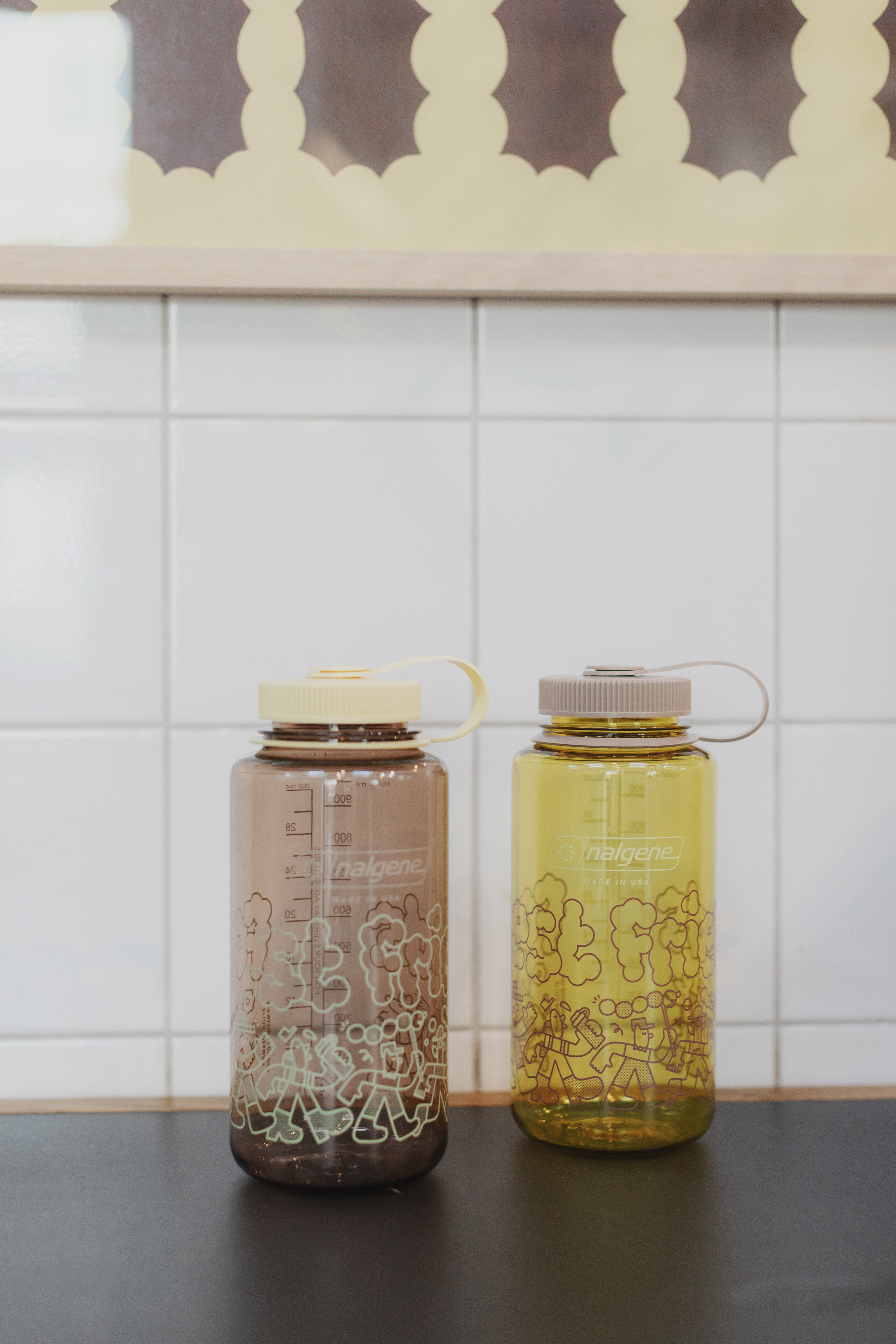
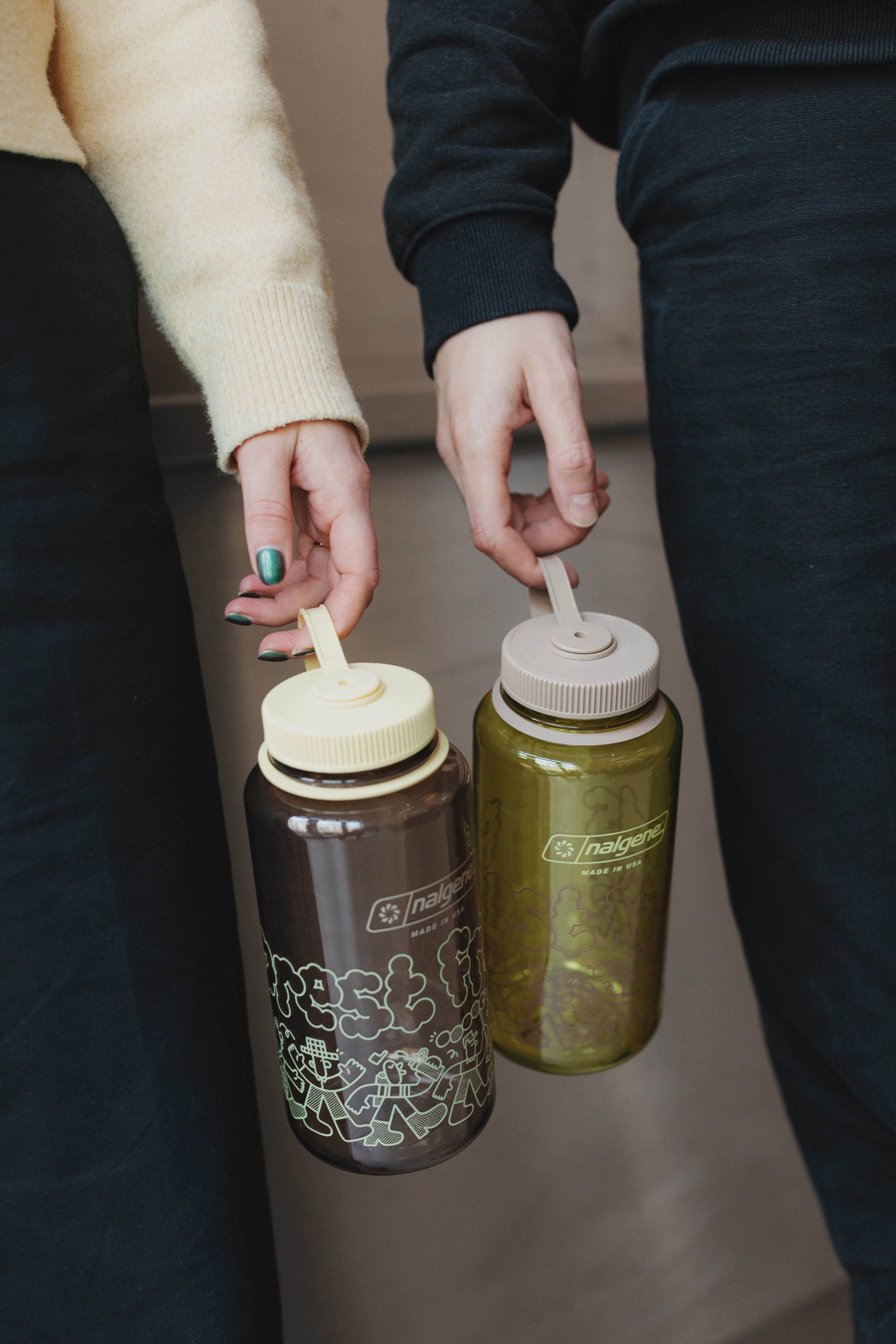
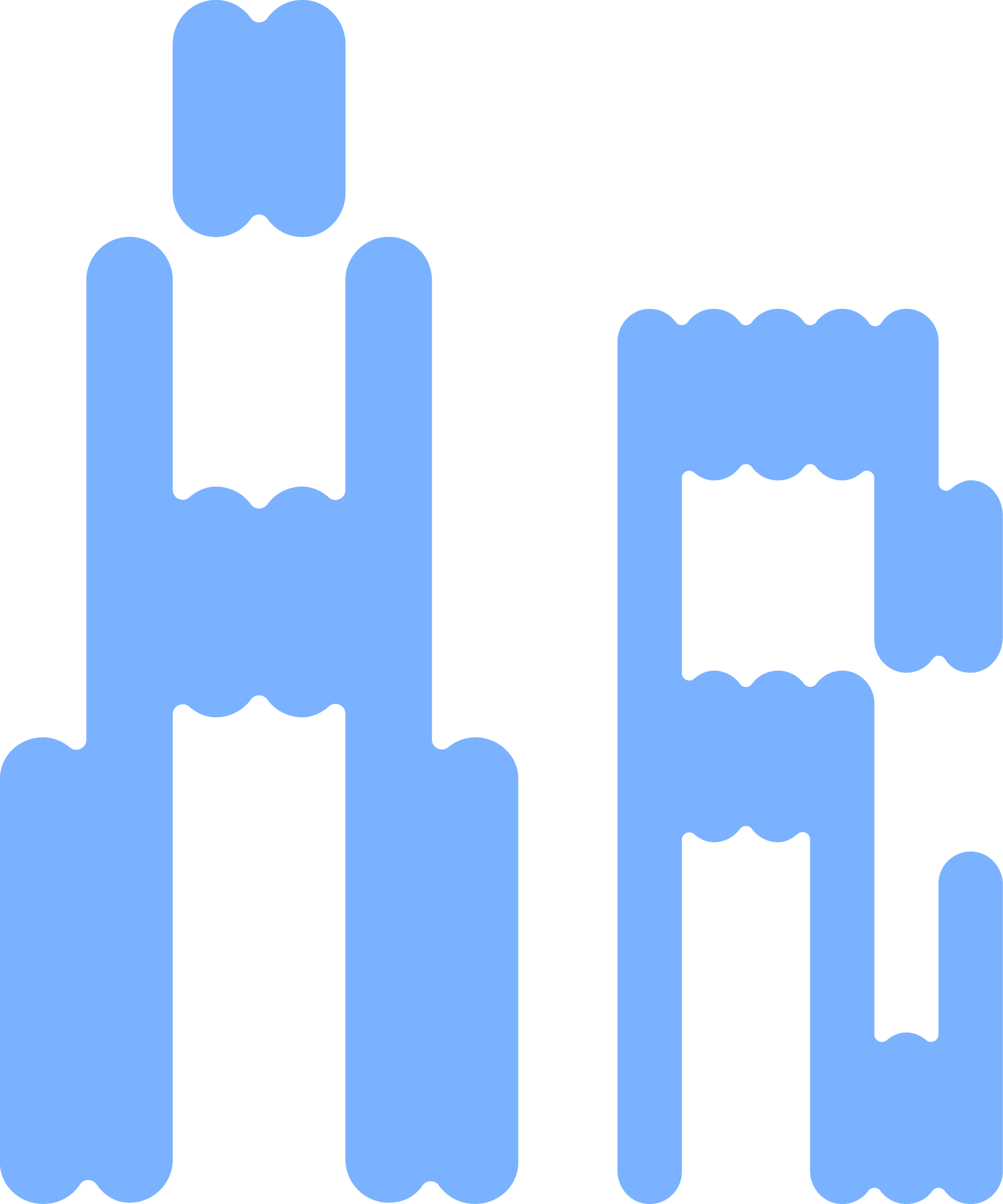
Forest Friends bottle (collab with Maxim de Gilder)
Nalgene bottle
1 liter
BPA/BPS Free
Colorways yellow or brown
Exclusively availble in-shop at Man Met Bril Koffie
Forest Friends bottle: €25
Nalgene bottle
1 liter
BPA/BPS Free
Colorways yellow or brown
Exclusively availble in-shop at Man Met Bril Koffie
Forest Friends bottle: €25
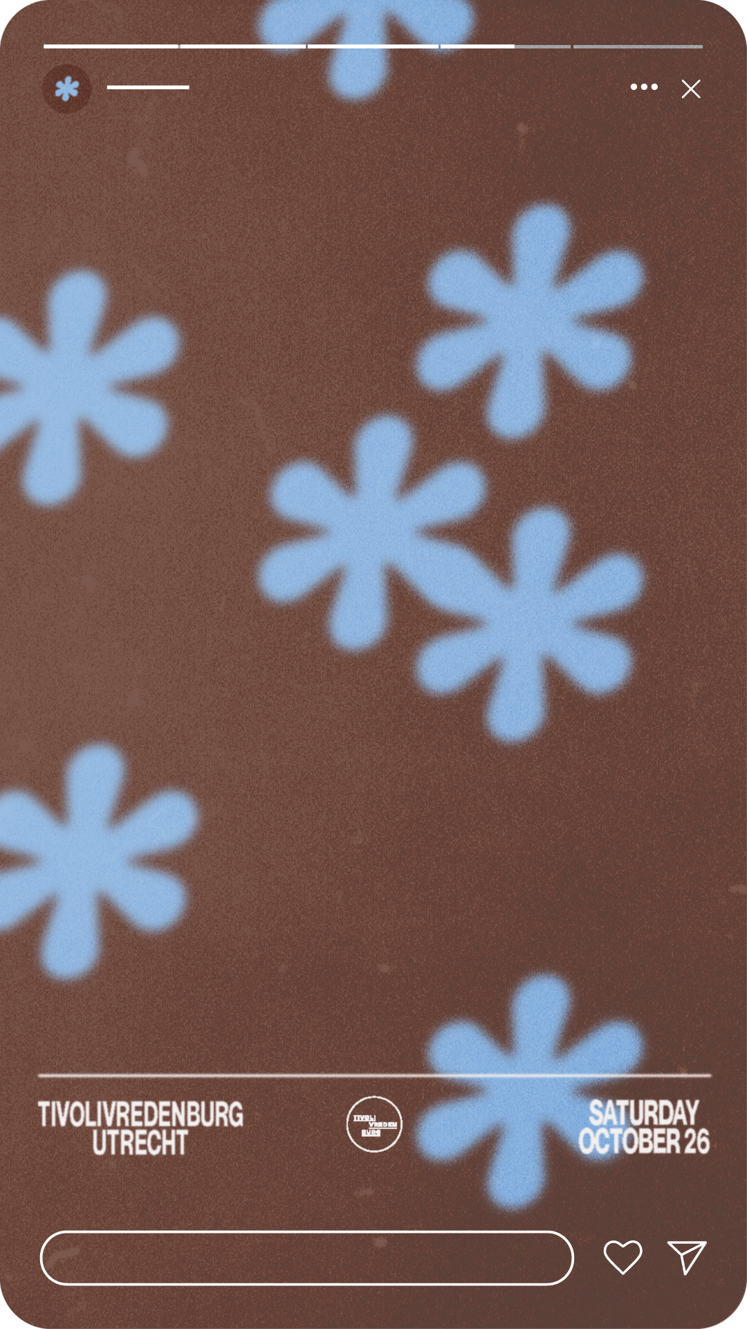
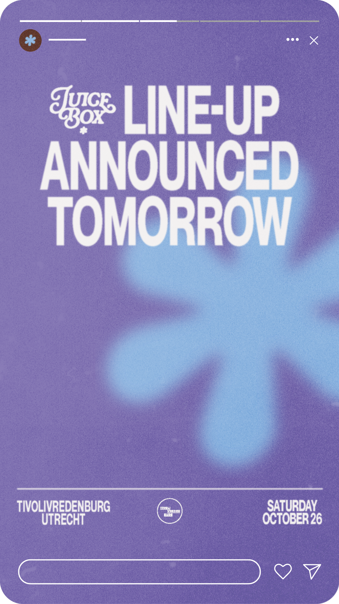
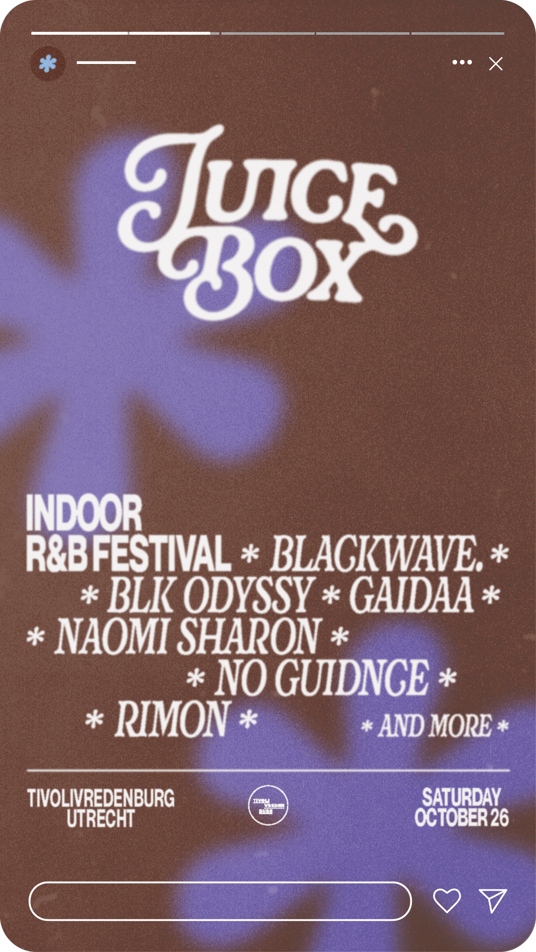
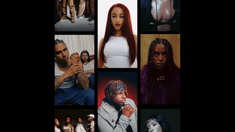
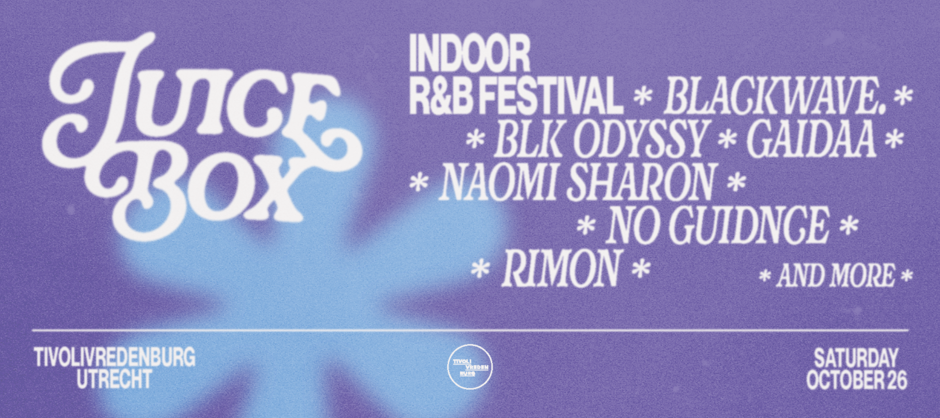
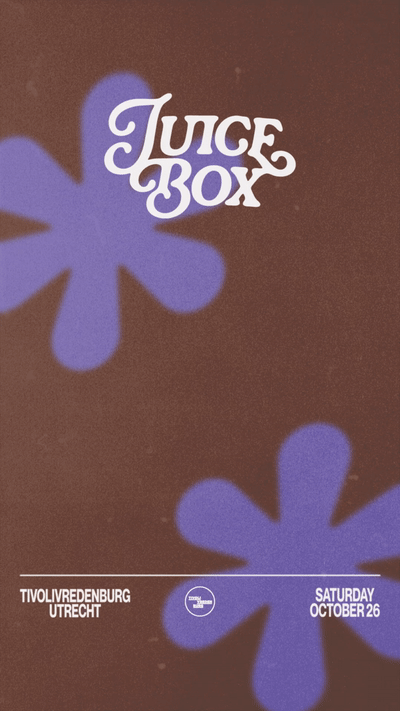
Juicebox
Visual identityThrilling news because on the 26th of October TivolliVredenburg will host a brand new alternative R&B festival. The Juicebox line-up features (inter)national super talents like Naomi Sharon, Rimon and BLK ODDYSY amongst many others.
Together we cooked up some deliciously nostalgic artwork and graphics.
Collaboration
The Phoney Club
Animation
Mia Radić

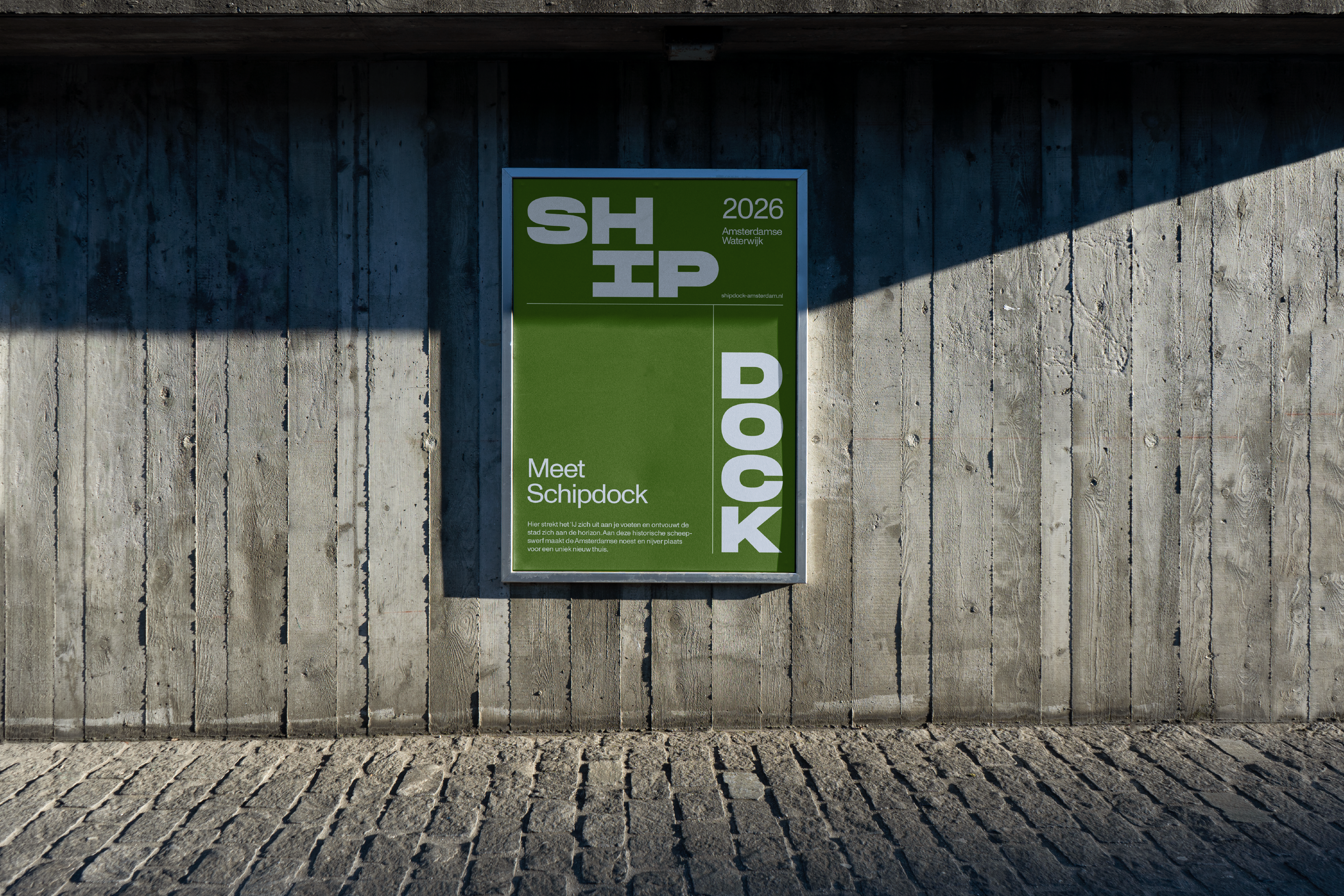
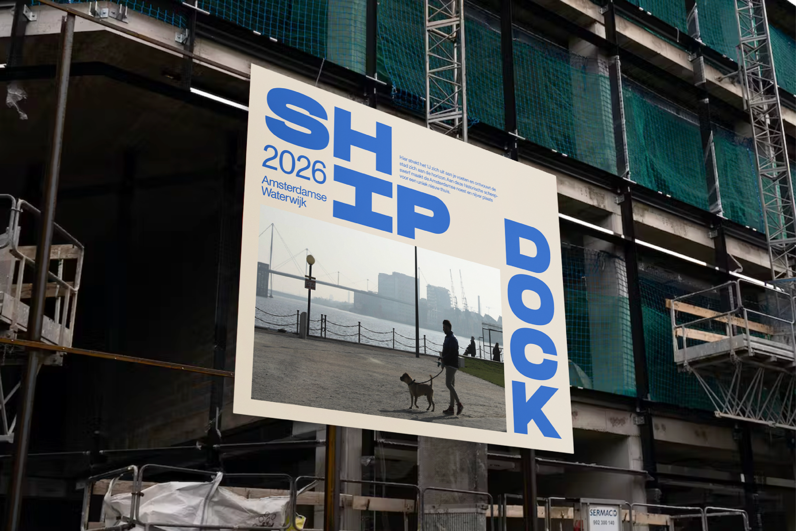
Shipdock
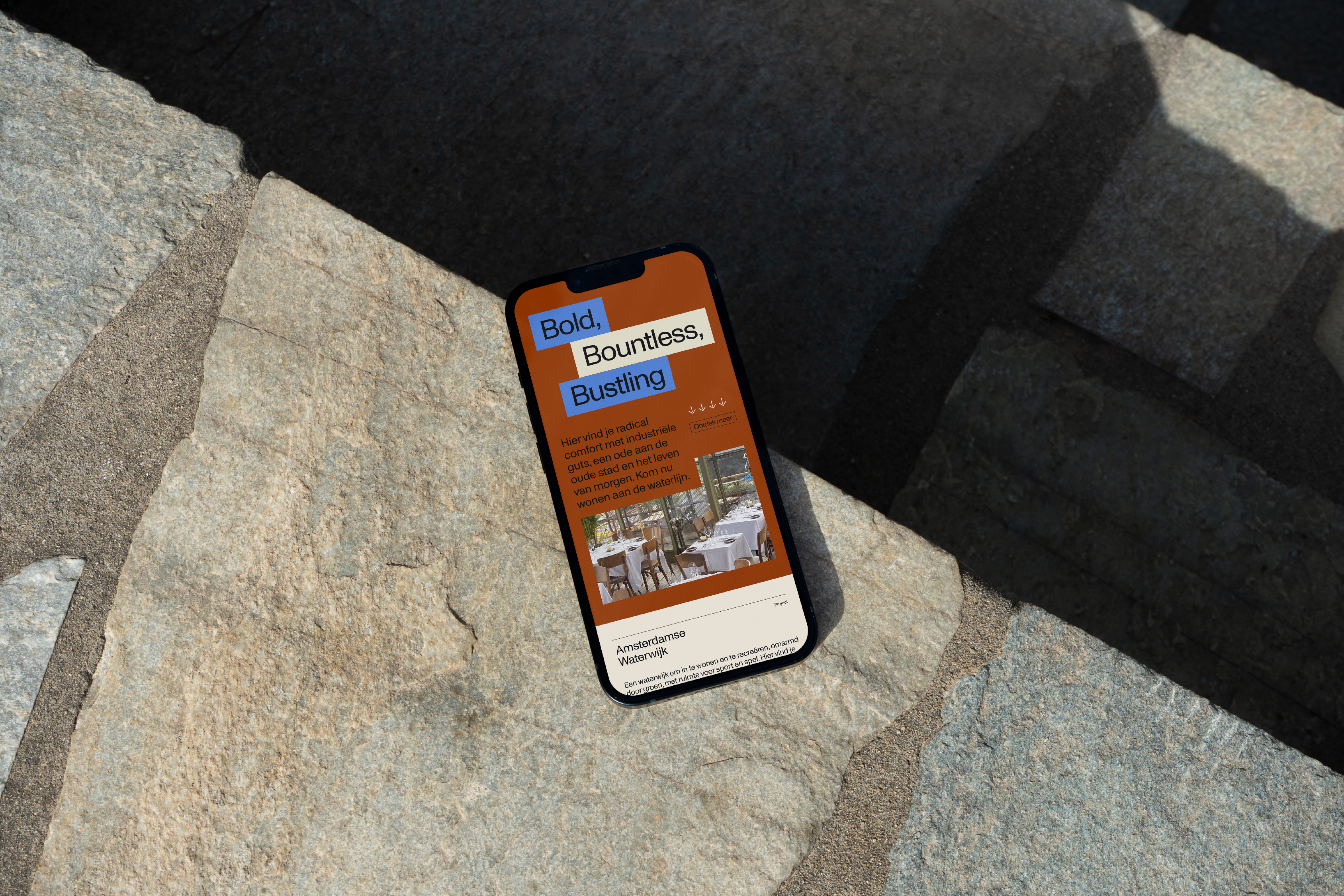
Brand identity
A brave brand for the gutsy neighbourhood of Shipdock Amsterdam. While working at The Phoney Club we designed this identity that embraces the fundamental characteristics of the location, by drawing inspiration from its industrial maritime history.
The logo is flexible and can be used in various configurations. This makes the identity dynamic and adds a energetic touch to the designs. The letters are bold and graphic, with an industrial character.
Credits
VolkerWessels
Fred Developers
Avenue Concordia.
Client
Amvest


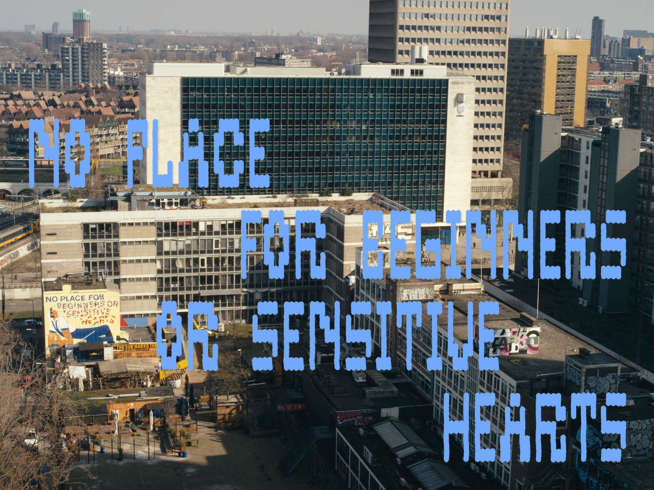
Not for beginners or sensitive hearts
Title shot and subtitles
How not to fall in love with Het Schieblock (area in Rotterdam) after watching this film by Joep van Weelden. Really loved making the title for such a nice project, especially since it's also my work home. The letters are based on the facade with its many windows, which create a perfect grid of rectangular shapes.
Shots and edit by Joep van Weelden and Nando Dullaart
Online soon!


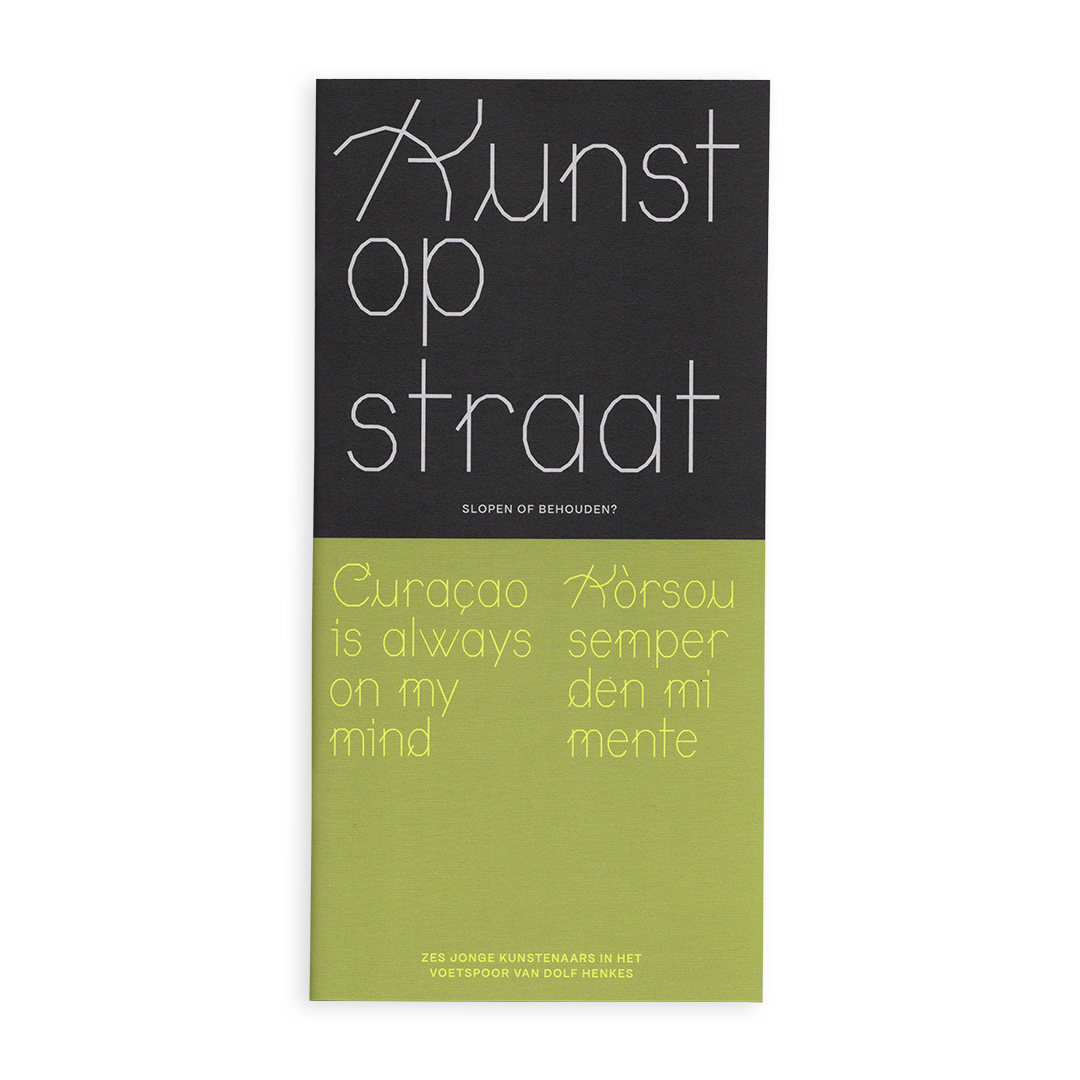
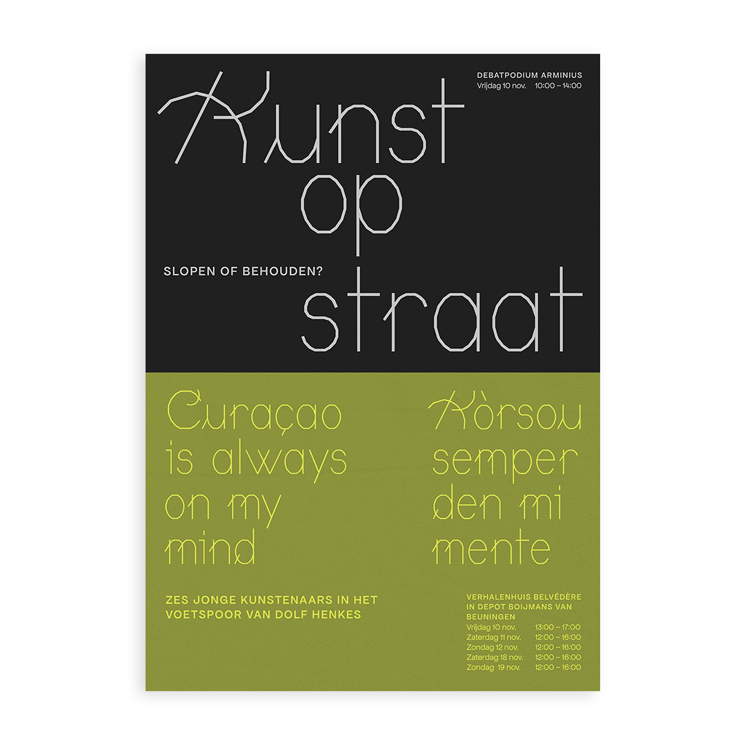
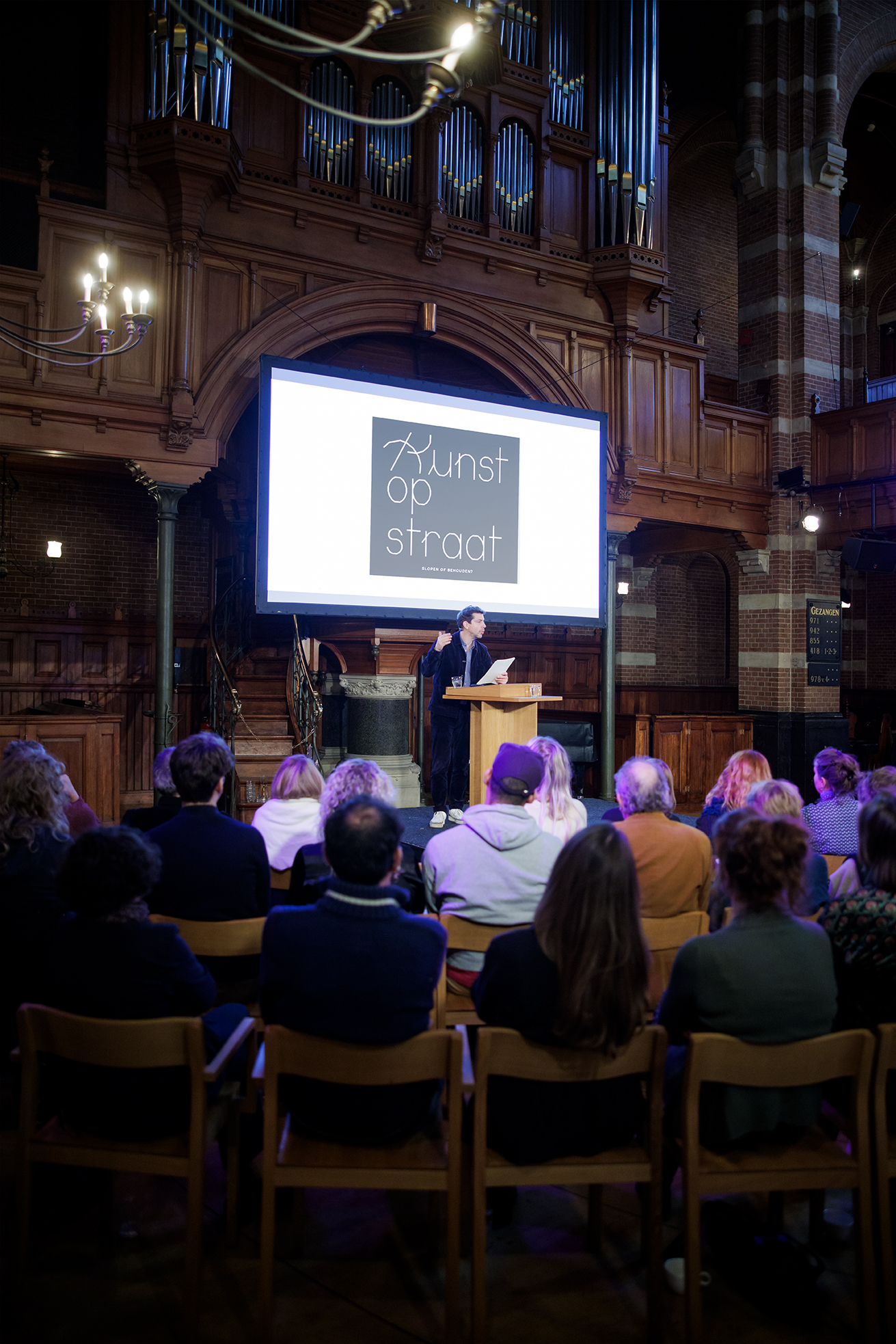
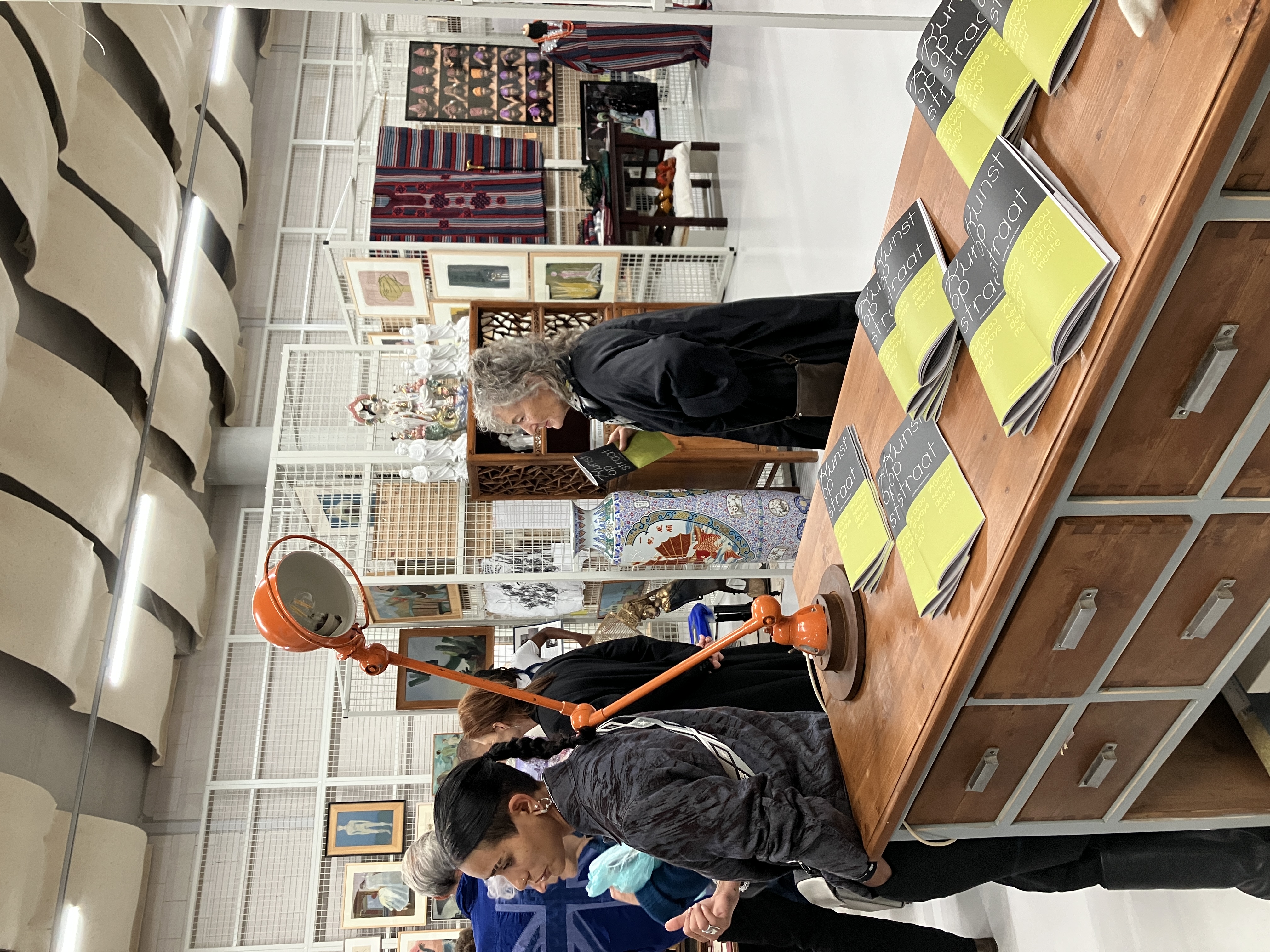
Dolf Henkes event
Identity + publication
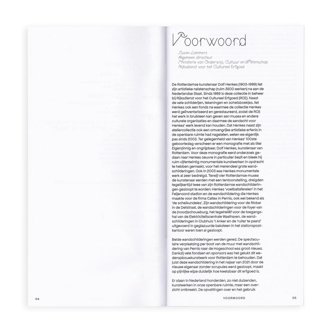
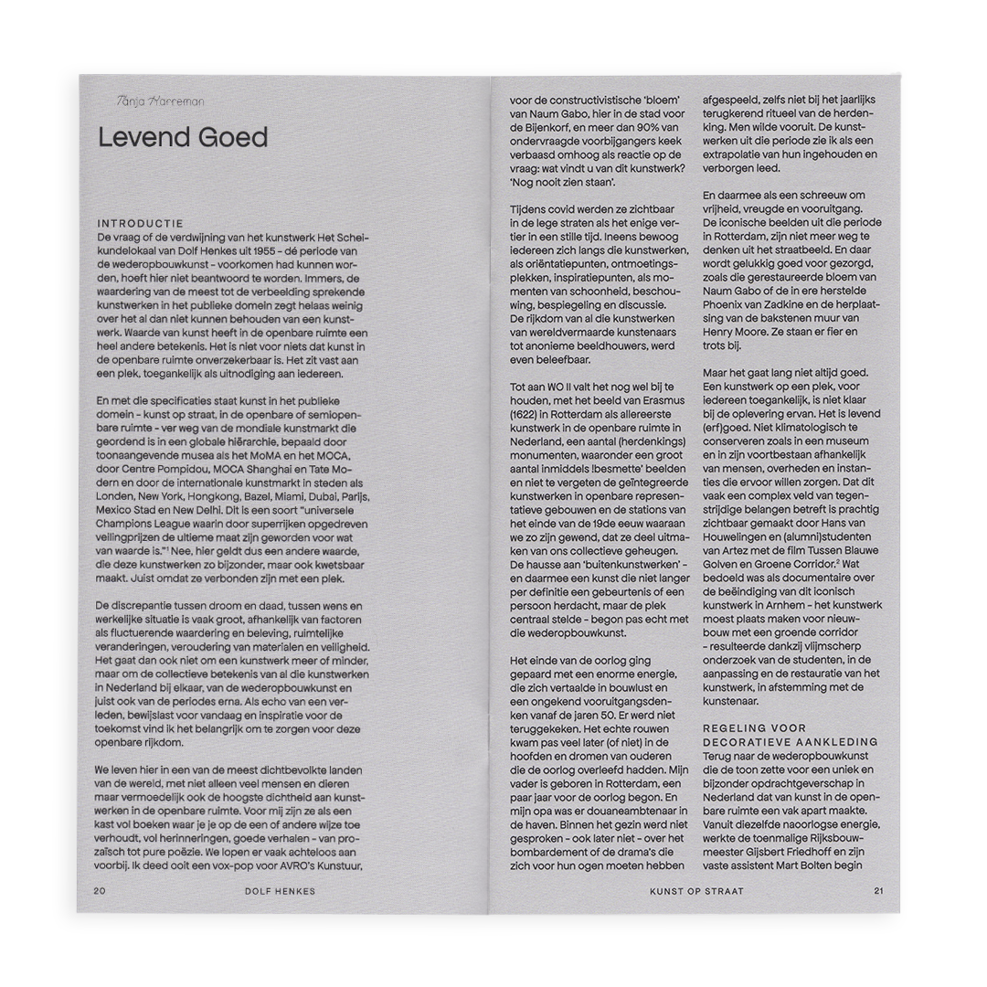
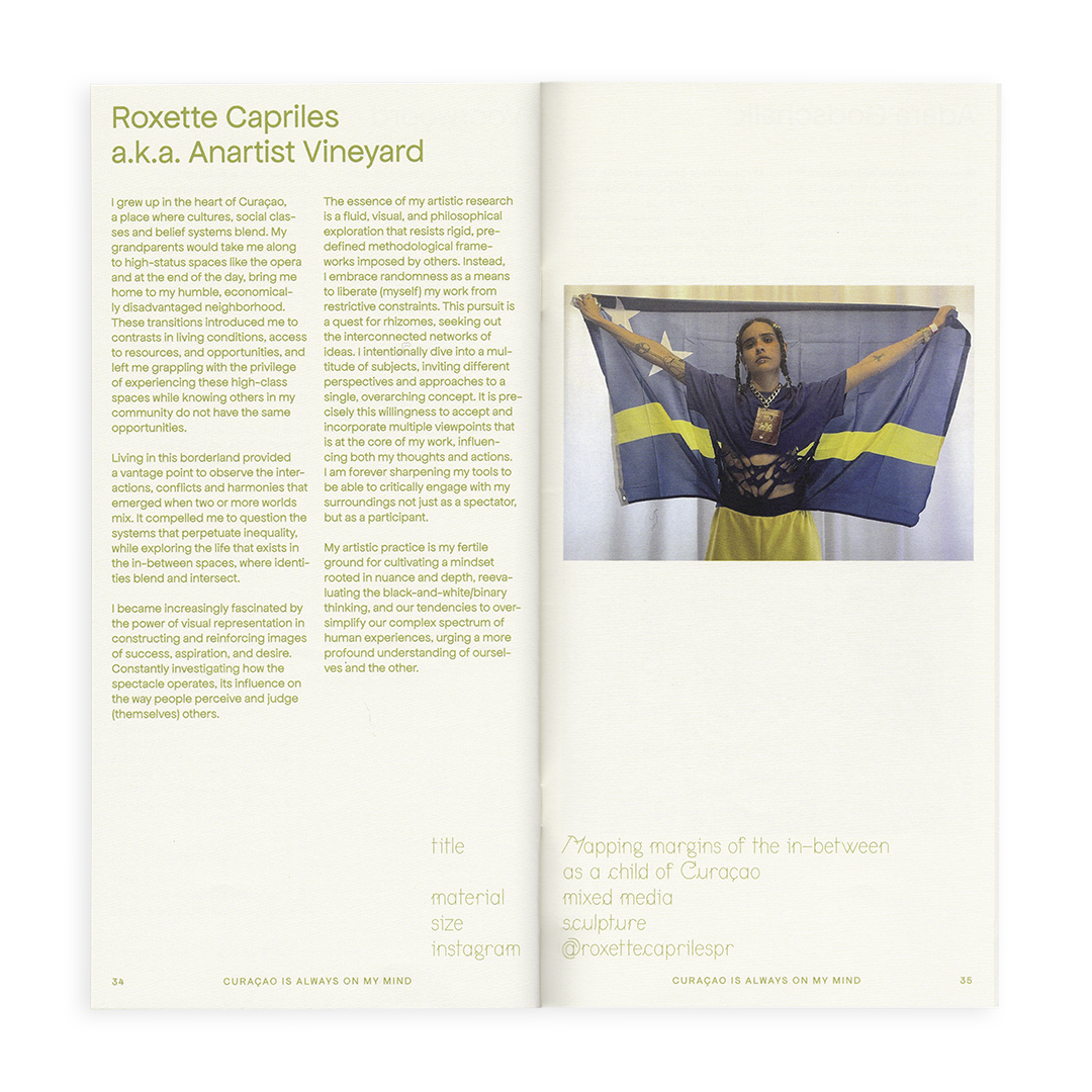
In response to the demolition of Dolf Henkes' mural, an entire day was dedicated to this artist. The morning commenced with a symposium at Arminius, followed by an afternoon exhibition at Verhalenhuis Belvedere in the Depot Boijmans Van Beuningen. For this special occasion, I had the privilege of designing the visual identity, with the icing on the cake being a publication that was offered to all visitors.
Translating the intricate details of this event into an identity was an enjoyable puzzle. The dual-color division delineates the morning and afternoon planning. This color scheme reflected in the publication to as a way of enhancing the different chapter division.
Translating the intricate details of this event into an identity was an enjoyable puzzle. The dual-color division delineates the morning and afternoon planning. This color scheme reflected in the publication to as a way of enhancing the different chapter division.